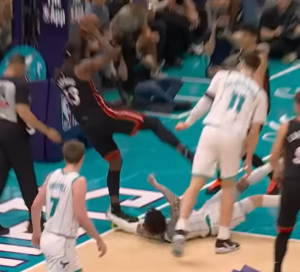
One of Nike’s best innovations has been expanding the variety of jersey options. Introducing Statement and City Edition jerseys gave fans more choices and freed teams from the traditional home, away, or alternate designs. These new concepts added to an impressive line of jerseys for the Charlotte Hornets.
Fans are excitedly buzzing with the “Mint City” jerseys set to return this season. Debuting during the 2020-21 season, the jersey quickly became one of Charlotte’s most popular designs, thanks to its sleek color scheme and nod to the city’s history. The Hornets will once again take the court looking sharp. But what are some of the other popular City Edition jerseys they’ve had? Let’s dive into the standout designs that have captured fans’ attention.
How Hornets City Edition Jerseys Reflect Charlotte’s Basketball Heritage
3rd: Buzz City Gold Rush
The “Buzz City Gold Rush” jerseys, introduced last season, brought a fresh twist to the Hornets’ traditional look. Known for their signature purple and teal combination, this edition added a bold gold accent. The design drew inspiration from Charlotte’s rich history as the site of the first U.S. Branch Mint and the Carolina Gold Rush of the early 1800s.
The uniforms proudly feature “Buzz City” across the chest, a name that emerged during the team’s rebranding from the Charlotte Bobcats back to the Charlotte Hornets. The teal jersey design is accented with mint and gold, while partial primary logos in gold, white, and deep teal are showcased on each leg. The mint side panels across the jersey and shorts have a subtle pattern mimicking the texture of a hornet’s hive. An enlarged gold hornet patch on the shorts adds another standout element, along with the phrase “The Hive is Alive” on the jock tag — a nod to the team’s passionate fan base.

2nd: “CLT”
One of the most requested additions by Hornets fans was incorporating “CLT” into the team’s jerseys. However, this was initially blocked due to “CLT” being trademarked by Aviate, a company known for trademarking airport codes and selling related merchandise. Fortunately, the two parties agreed, allowing the Hornets to bring this much-anticipated design to life.
During the 2022-23 season, the Hornets debuted the “CLT” look for the first time. The uniform proudly features the “CLT” abbreviation, which is widely used throughout Charlotte, including as the city’s airport code. This marked the first time “CLT” appeared on a Hornets jersey. The design features gold letters and numbers with mint trim on the front and back. The player’s name appears in plain gold without an outline. The coin-ridged pinstripes from the 2020-21 design return, alternating in gold and mint on both the jersey and shorts. Above the jock tag on the left front of the jersey is a gold “Buzz City” logo and a subtle rendering of Queen Charlotte, paying tribute to the city’s namesake.
The shorts feature a gold “C” with mint trim on the waistband. Secondary logos in gold and granite with mint accents appear on each leg. The neck, arm, and leg openings also have mint and gold trim. This completes the look with a cohesive and polished finish.

1st: 75th Anniversary Edition
When the NBA celebrated its 75th anniversary during the 2021-22 season, the league went all out to honor its rich history. Alongside the release of the NBA 75th anniversary team and the 15 greatest coaches, one of the standout elements was the special City Edition jerseys. The designers blended iconic elements from each team’s past into one celebratory uniform.
The Hornets’ 75th-anniversary jersey paid tribute to their classic look. It featured multicolored pinstripes worn from 1988 to 1997. A vertically gradated honeycomb pattern was inspired by the Charlotte Coliseum court design. One unique feature was the cursive font, which had never been used on a Hornets uniform before. However, fans recognized it from old pennants and hats. The designers used the current Hornets font for the numbers on the front and back. The right-justified front number subtly honored the Bobcats era.
An “EST. in 1988” print appeared above the jock tag on the bottom right of the uniform, celebrating the team’s founding. The shorts included the classic Hornets logo on one leg and a script wordmark on the other, while the waistband incorporated the “H” logo, a tribute to the original 1988 uniforms. Completing the look, a honeycomb pattern at the bottom of the shorts mirrored the design on the jersey’s upper half.

In Conclusion
The Charlotte Hornets have impressed fans with their unique and meaningful jersey designs. Each design honors the city’s history and the team’s identity. Fan favorites like the “Mint City” jerseys have returned strongly. Innovative designs like the “Buzz City Gold Rush” and the 75th Anniversary Edition also stand out. The Hornets have embraced both the past and the present with these jerseys. They look great on the court and resonate with fans. As the team evolves, so will their jerseys, ensuring fans always have something exciting to look forward to.


